Board and Batten Dining Area Accent Wall
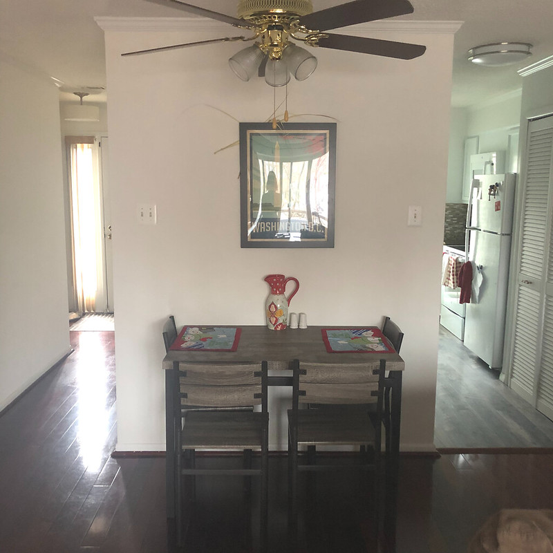
The way our first floor is set up in our house, the living room and dining area are all sort of one big space. We've divide them up with the layout of our furniture, but for a while now, I've felt like the wall in the dining area just needed something.
It was super plain and looked exactly like all the walls in the rest of the room. So it never really felt like it was its own distinct space.
I'd been banging my head against the wall trying to figure out what to do with it. I debated painting it. I spent hours looking at wallpaper options. But nothing really felt right for the space.
So I asked Megan for ideas. She has a really good eye based on the way she's designed her own house, and I very recently learned that she also took a bunch of interior design courses back in the day.
So I sent her some pictures and a video of me walking around the space, hoping she'd have some ideas.
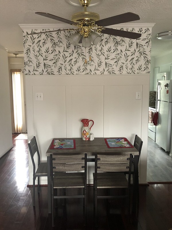
A couple of weeks later she narrowed down some options and shared some pictures of a board and batten wallpapered wall. I was instantly in love and knew the board and batten look would add the perfect amount of texture to the space, and the wallpaper would add just a little bit of color.
The timing was pretty perfect because one of the Christmas presents my husband and I got for each other was a saw.
When I was back in PA for Christmas, I shared the project with my dad because I wanted his thoughts on how to make this work with our crappy baseboards. I also was curious to get his ideas on how to handle the outside corners on the wall. I didn't want to have ugly ends in either the hallway leading to the front entry or the walkway into the kitchen.
We kicked around a lot of ideas, and he sketched me out some plans.
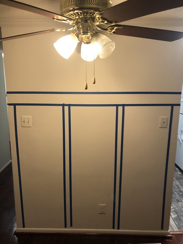
Back in DC, we started putting the plan into action. We taped off the wall to get a sense of the dimensions, so we'd know exactly what lengths of wood we'd need to buy. We measured multiple times to make sure we had everything right and to ensure the space between the vertical wood pieces was all even.
After a trip to the hardware store for wood, we got to work.
Step 1: Gently pry off the original baseboards and quarter round moulding. We needed to replace the baseboard because our current one beveled back into the wall, which meant there wasn't a flat surface for the vertical wood pieces we were going to install to rest on. We planned to re-use the quarter round moulding, so we were extra careful taking that part off.
Once we had the baseboards off, we of course got a laugh at the hole we found in the wall. Every time we do a project, we discover something ridiculous.
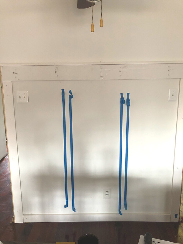
Step 2: Install the wood framing the wall. We started with the top horizontal piece. We used a 1x6 board with a 1x2 installed along the top edge to create a small ledge for us to rest pictures on. It was really important to find the studs in the wall to get this installed and make sure it was secure.
Excuse all the shadows in the pictures. In such a small space there's not a lot of room to move things around to get them out of the way for better pictures.
Once we had the top board installed, we measured again for the two vertical boards on the edges. We used 1x4s for all the vertical boards. These two boards on the edge we planned to run to the floor. Because things settle and houses are not square, these two pieces were not the same length. I highly recommend measuring each side separately and not assuming both boards will need to be the same length because that's likely not going to be the case.
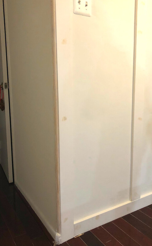
To deal with the corners of the wall, we ended up buying 1 inch quarter rounds that we cut to the right length and installed on the edge of the wood and the wall. This ensured that there'd be a nice smooth finish from the hallways that approach this wall.
The last part of the frame we installed was the new baseboard. We designed this so the baseboard would run in between the two vertical end pieces. This was just another 1x4 that we cut to the correct dimensions.
Step 3: Install the remaining vertical boards. Again we measured everything multiple times. Even though these two boards were sitting pretty close together, they still weren't the same length. It took extra time to stop and measure over and over again, but it was worth it to make sure we got everything exactly right.
Once we had the boards cut, we had to double check the spacing between them again to ensure all the openings would still be even. We ended up needing to shift things slightly but eventually got it all set and nailed the final boards into the walls.
Step 4: All the tedious stuff necessary to prep for painting.
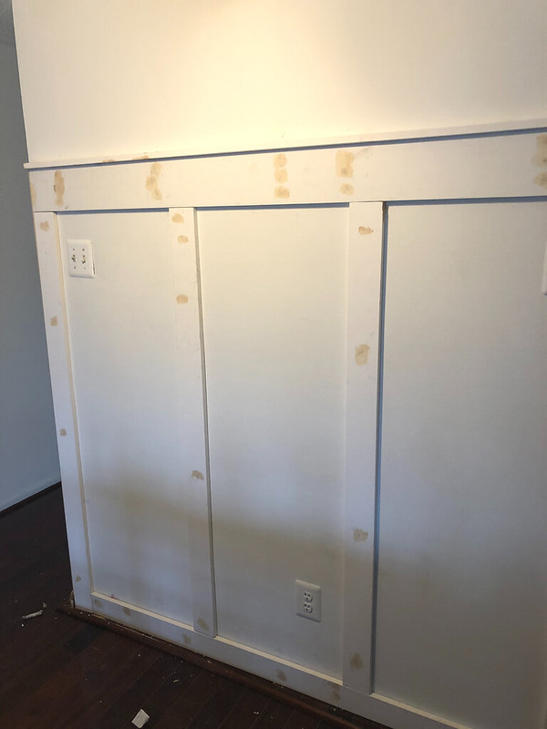
I used wood filler to fill in all the nail holes and smooth out one or two of the places the wood got a bit dinged up.
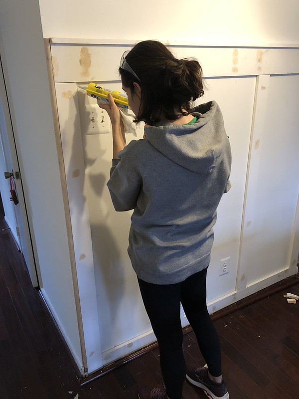
Then I caulked all the seams between the wall and the wood and between the different pieces of wood.
Step 5: Priming and painting. I had bought primed wood, but because the quarter rounds weren't primed, I gave everything a coat of primer to protect it and ensure an even finish. I was hoping to only need a single coat of paint, but no such luck. I could still see some of the places where I had filled nail holes, so a second coat was necessary.
The wall stayed in its almost finished state for a few days while I waited for the wallpaper to arrive.
Even just with the board and batten, I was already loving the extra character this wall had.
Adding the wallpaper a few days later just made me love it that much more.
All in all, this project took about 11 hours from planning through final execution, and the supplies cost about $150.
Supply list:
- 1 1x6x8 for the horizontal top beam
- 1 1x2x8 for the picture ledge
- 5 1x4x8s for the baseboard and vertical pieces
- 2 1 inch quarter rounds
- Stud finder
- Finishing nails, counter sink and hammer (or a nail gun to save time)
- Wood filler
- Paintable caulk
- Primer
- Paint
- Wallpaper


